
A Gentle Introduction to SHAP for Tree-Based Models
Image by Author
Introduction
Machine learning models have become increasingly sophisticated, but this complexity often comes at the cost of interpretability. You can build an XGBoost model that achieves excellent performance on your housing dataset, but when stakeholders ask “why did the model predict this specific price?” or “which features drive our predictions?” you’re often left with limited answers beyond feature importance rankings.
SHAP (SHapley Additive exPlanations) bridges this gap by providing a principled way to explain individual predictions and understand model behavior. Unlike traditional feature importance measures that only tell you which features are generally important, SHAP shows you exactly how each feature contributes to every single prediction your model makes.
For tree-based models like XGBoost, LightGBM, and Random Forest, SHAP offers particularly elegant solutions. Tree models make decisions through a series of splits, and SHAP can trace these decision paths to quantify each feature’s contribution with mathematical precision. This means you can move beyond black-box predictions to provide clear, quantifiable explanations that satisfy both technical teams and business stakeholders.
In this article, we’ll explore how to apply SHAP to tree-based models using a well-optimized XGBoost regressor. You’ll learn to interpret individual house price predictions, understand global patterns across your entire dataset, and communicate model insights effectively. By the end, you’ll have practical tools to make your tree-based models not just accurate, but explainable.
Building on Our XGBoost Foundation
Before we explore SHAP explanations, we need a well-performing model to explain. In our previous article on XGBoost, we built an optimized regression model for the Ames Housing dataset that achieved a 0.8980 R² score. The model demonstrates XGBoost’s native capabilities for handling missing values and categorical data, while using Recursive Feature Elimination with Cross-Validation (RFECV) to identify the most predictive features.
Here’s a quick recap of what we accomplished:
- Native data handling: XGBoost processed 829 missing values automatically without manual imputation
- Categorical encoding: Converted categorical features to numeric codes for optimal tree splitting
- Feature optimization: RFECV identified 36 optimal features from the original 83, balancing model complexity with predictive performance
- Strong performance: Achieved 0.8980 R² through careful tuning and feature selection
Now we’ll recreate this optimized model and apply SHAP to understand exactly how it makes its predictions.
|
1 2 3 4 5 6 7 8 9 10 11 12 13 14 15 16 17 18 19 20 21 22 23 24 25 26 |
# Building on our previous XGBoost model optimization import pandas as pd import numpy as np import xgboost as xgb import matplotlib.pyplot as plt from sklearn.feature_selection import RFECV from sklearn.model_selection import train_test_split
# Load the dataset (same as our XGBoost post) Ames = pd.read_csv(‘Ames.csv’)
# Convert selected features to ‘object’ type to treat them as categorical for col in [‘MSSubClass’, ‘YrSold’, ‘MoSold’]: Ames[col] = Ames[col].astype(‘object’)
# Convert all object-type features to categorical and then to codes categorical_features = Ames.select_dtypes(include=[‘object’]).columns for col in categorical_features: Ames[col] = Ames[col].astype(‘category’).cat.codes
# Select features and target X = Ames.drop(columns=[‘SalePrice’, ‘PID’]) y = Ames[‘SalePrice’]
print(f“Dataset loaded: {X.shape[0]} houses, {X.shape[1]} features”) print(f“Target variable: SalePrice (mean: ${y.mean():,.2f})”) |
Output:
|
Dataset loaded: 2579 houses, 83 features Target variable: SalePrice (mean: $178,053.44) |
With our data prepared, we’ll now apply the same RFECV optimization process that gave us our best-performing model:
|
1 2 3 4 5 6 7 8 9 10 11 12 13 14 15 16 17 18 19 20 21 22 23 24 25 26 27 |
# Recreate our optimized XGBoost model with RFECV feature selection xgb_model = xgb.XGBRegressor(seed=42, enable_categorical=True) rfecv = RFECV(estimator=xgb_model, step=1, cv=5, scoring=‘r2’, min_features_to_select=1)
# Fit RFECV to get the optimal features (this gives us our 36 features) print(“Performing feature selection with RFECV…”) rfecv.fit(X, y)
# Get the selected features X_selected = X.iloc[:, rfecv.support_] print(f“Optimal number of features selected: {rfecv.n_features_}”)
# Cross-validate the XGB model using only the selected features cv_scores = cross_val_score(xgb_model, X.iloc[:, rfecv.support_], y, cv=5, scoring=‘r2’) mean_r2 = cv_scores.mean() print(f“Cross-validated R² score: {mean_r2:.4f}”)
# Split the data for our SHAP analysis X_train, X_test, y_train, y_test = train_test_split( X_selected, y, test_size=0.2, random_state=42 )
# Train our final optimized model final_model = xgb.XGBRegressor(seed=42, enable_categorical=True) final_model.fit(X_train, y_train)
print(f“Model trained on {X_train.shape[0]} houses with {X_train.shape[1]} features”) |
Output:
|
Performing feature selection with RFECV... Optimal number of features selected: 36 Cross–validated R² score: 0.8980 Model trained on 2063 houses with 36 features |
We’ve recreated our high-performing XGBoost model with the same 36 carefully selected features and 0.8980 R² performance. This gives us a solid foundation for SHAP analysis—when we explain model predictions, we’re explaining decisions made by a model we know performs well and generalizes effectively to new data.
With our optimized model ready, we can now explore how SHAP helps us understand what drives each prediction.
SHAP Fundamentals: The Science Behind Model Explanations
What Makes SHAP Different
Traditional feature importance tells you which variables are generally important across your dataset, but it can’t explain individual predictions. If your XGBoost model predicts a house will sell for \$180,000, standard feature importance might tell you that “OverallQual” is the most important feature overall, but it won’t tell you how much that specific house’s quality rating contributed to the \$180,000 prediction.
SHAP solves this by decomposing every prediction into individual feature contributions. Each feature gets a SHAP value that represents its contribution to moving the prediction away from the baseline (the model’s average prediction). These contributions are additive: baseline + sum of all SHAP values = final prediction.
The Shapley Value Foundation
SHAP builds on Shapley values from cooperative game theory, which provide a mathematically principled way to distribute “credit” among players in a game. In machine learning, the “game” is making a prediction, and the “players” are your features. Each feature gets credit based on its marginal contribution across all possible combinations of features.
The genius of this approach is that it satisfies several desirable properties:
- Efficiency: All SHAP values sum to the difference between the prediction and baseline
- Symmetry: Features that contribute equally get equal SHAP values
- Dummy: Features that don’t affect the prediction get zero SHAP values
- Additivity: The method works consistently across different model combinations
Choosing the Right SHAP Explainer
SHAP offers different explainers optimized for different model types:
TreeExplainer is designed specifically for tree-based models like XGBoost, LightGBM, RandomForest, and CatBoost. It leverages the tree structure to compute exact SHAP values efficiently, making it both fast and accurate for our use case.
KernelExplainer works with any machine learning model by treating it as a black box. It approximates SHAP values by training a surrogate model, making it model-agnostic but computationally expensive.
LinearExplainer provides fast, exact SHAP values for linear models by using the model coefficients directly.
For our XGBoost model, TreeExplainer is the optimal choice. It can compute exact SHAP values in seconds rather than minutes, and it understands how tree-based models actually make decisions.
Setting Up SHAP for Our Model
Before we proceed, you’ll need to install SHAP if you haven’t already. You can install it using pip with pip install shap. For detailed installation instructions and system requirements, visit the official SHAP documentation.
Let’s initialize our SHAP TreeExplainer and calculate SHAP values for our test set:
|
1 2 3 4 5 6 7 8 9 10 11 12 13 14 15 16 17 18 19 20 21 22 |
#Import the SHAP package import shap
# Initialize SHAP TreeExplainer for our XGBoost model explainer = shap.TreeExplainer(final_model)
# Calculate SHAP values for our test set print(“Calculating SHAP values…”) shap_values = explainer.shap_values(X_test)
print(f“SHAP values calculated for {shap_values.shape[0]} predictions”) print(f“Each prediction explained by {shap_values.shape[1]} features”)
# The base value (expected value) – what the model predicts on “average” print(f“Model’s base prediction (expected value): ${explainer.expected_value:,.2f}”)
# Quick verification: SHAP values should be additive sample_idx = 0 model_pred = final_model.predict(X_test.iloc[[sample_idx]])[0] shap_sum = explainer.expected_value + np.sum(shap_values[sample_idx]) print(f“Verification – Model prediction: ${model_pred:,.2f}”) print(f“Verification – SHAP sum: ${shap_sum:,.2f} (difference: ${abs(model_pred – shap_sum):.2f})”) |
Output:
|
Calculating SHAP values... SHAP values calculated for 516 predictions Each prediction explained by 36 features Model‘s base prediction (expected value): $176,996.61 Verification – Model prediction: $165,708.67 Verification – SHAP sum: $165,708.70 (difference: $0.03) |
The verification step is important—it confirms that our SHAP values are mathematically consistent. The tiny difference (typically less than $1) between the model prediction and the sum of SHAP values demonstrates that we’re getting exact, not approximated, explanations.
With our SHAP explainer ready and values calculated, we can now examine how these explanations work for individual predictions.
Understanding Individual Predictions
The real value of SHAP becomes apparent when you examine individual predictions. Instead of wondering why your model predicted a specific price, you can see exactly how each feature influenced that decision. Let’s walk through a concrete example using one house from our test set.
Analyzing a Single House Prediction
We’ll start by selecting an interesting house and examining what our model predicts:
|
1 2 3 4 5 6 7 8 9 10 11 12 13 14 15 16 17 18 19 20 21 22 23 24 25 26 |
# Select an interesting prediction to explain sample_idx = 0 # You can change this to explore different houses sample_prediction = final_model.predict(X_test.iloc[[sample_idx]])[0] actual_price = y_test.iloc[sample_idx]
print(f“Analyzing prediction for house index {sample_idx}:”) print(f“Predicted price: ${sample_prediction:,.2f}”) print(f“Actual price: ${actual_price:,.2f}”) print(f“Prediction error: ${abs(sample_prediction – actual_price):,.2f}”)
# Create SHAP waterfall plot plt.figure(figsize=(12, 8)) shap.waterfall_plot( shap.Explanation( values=shap_values[sample_idx], base_values=explainer.expected_value, data=X_test.iloc[sample_idx], feature_names=X_test.columns.tolist() ), max_display=15, # Show top 15 contributing features show=False ) plt.title(f‘How Our Model Predicts ${sample_prediction:,.0f} for This House’, fontsize=14, fontweight=‘bold’, pad=20) plt.tight_layout() plt.show() |
Output:
|
Analyzing prediction for house index 0: Predicted price: $165,708.67 Actual price: $166,000.00 Prediction error: $291.33 |
Our model predicts this house will sell for \$165,709, very close to its actual sale price of \$166,000 — an error of only \$291. But more importantly, we can now see exactly why the model made this prediction.
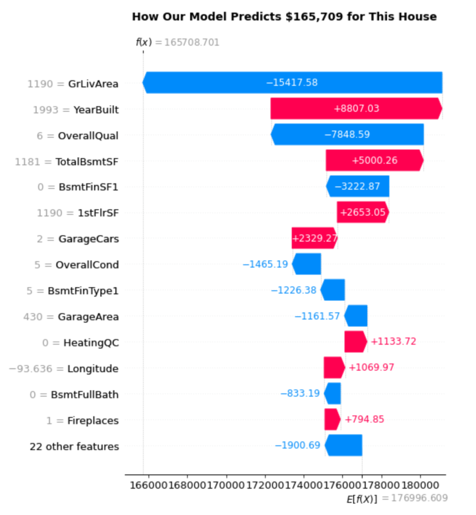
Reading the Waterfall Plot
The waterfall plot reveals the step-by-step decision process. Here’s how to interpret it:
Starting Point: The model’s baseline prediction is $176,997 (shown at the bottom right as E[f(X)]). This represents the average house price the model would predict without knowing anything about the specific house.
Feature Contributions: Each bar shows how a specific feature pushes the prediction up (red/pink bars) or down (blue bars) from this baseline:
- GrLivArea (1190 sq ft): The biggest negative impact at -$15,418. This house’s living area is below average, significantly reducing its predicted value.
- YearBuilt (1993): A strong positive contributor at +$8,807. Being built in 1993 makes this a relatively modern house, adding substantial value.
- OverallQual (6): Another large negative impact at -$7,849. A quality rating of 6 represents “good” condition, but this apparently falls short of what drives higher prices.
- TotalBsmtSF (1181 sq ft): Positive contribution of +$5,000. The basement square footage helps boost the value.
Final Calculation: Starting from \$176,997 and adding all the individual contributions (which sum to -$11,288) gives us our final prediction of \$165,709.
Breaking Down the Feature Contributions
Let’s examine the contributions more systematically:
|
1 2 3 4 5 6 7 8 9 10 11 12 13 14 15 16 17 18 19 20 21 22 |
# Analyze the feature contributions for our sample house feature_values = X_test.iloc[sample_idx] shap_contributions = shap_values[sample_idx]
# Create a detailed breakdown of contributions feature_breakdown = pd.DataFrame({ ‘Feature’: X_test.columns, ‘Feature_Value’: feature_values.values, ‘SHAP_Contribution’: shap_contributions, ‘Impact’: [‘Increases Price’ if x > 0 else ‘Decreases Price’ for x in shap_contributions] }).sort_values(‘SHAP_Contribution’, key=abs, ascending=False)
print(“Top 10 Feature Contributions to This Prediction:”) print(“=” * 60) for idx, row in feature_breakdown.head(10).iterrows(): impact_symbol = “↑” if row[‘SHAP_Contribution’] > 0 else “↓” print(f“{row[‘Feature’]:20} {impact_symbol} ${row[‘SHAP_Contribution’]:8,.0f} “ f“(Value: {row[‘Feature_Value’]:.1f})”)
print(f“\nBase prediction: ${explainer.expected_value:,.2f}”) print(f“Sum of contributions: ${shap_contributions.sum():+,.2f}”) print(f“Final prediction: ${explainer.expected_value + shap_contributions.sum():,.2f}”) |
Output:
|
Top 10 Feature Contributions to This Prediction: ============================================================ GrLivArea ↓ $ –15,418 (Value: 1190.0) YearBuilt ↑ $ 8,807 (Value: 1993.0) OverallQual ↓ $ –7,849 (Value: 6.0) TotalBsmtSF ↑ $ 5,000 (Value: 1181.0) BsmtFinSF1 ↓ $ –3,223 (Value: 0.0) 1stFlrSF ↑ $ 2,653 (Value: 1190.0) GarageCars ↑ $ 2,329 (Value: 2.0) OverallCond ↓ $ –1,465 (Value: 5.0) BsmtFinType1 ↓ $ –1,226 (Value: 5.0) GarageArea ↓ $ –1,162 (Value: 430.0)
Base prediction: $176,996.61 Sum of contributions: $–11,287.91 Final prediction: $165,708.70 |
This breakdown reveals several interesting patterns:
Size vs. Quality Trade-offs: The house suffers from below-average living space (1190 sq ft) but benefits from decent basement space (1181 sq ft). The model weighs these size factors heavily.
Age Premium: Being built in 1993 provides a significant boost. The model has learned that newer homes command higher prices, even when other factors aren’t optimal.
Quality Expectations: An OverallQual rating of 6 actually hurts this prediction. This suggests that in this price range or neighborhood, buyers expect higher quality ratings.
Garage Value: Having 2 garage spaces adds $2,329 to the prediction, showing how practical features influence price.
The Power of Individual Explanations
This level of detail transforms model predictions from mysterious black boxes into transparent, interpretable decisions. You can now answer questions like:
- “Why is this house priced lower than similar homes?” (Below-average living area)
- “What’s driving the value in this property?” (Relatively new construction, good basement space)
- “If we wanted to increase the predicted value, what should we focus on?” (Living area expansion would have the biggest impact)
These explanations work for every single prediction your model makes, giving you complete transparency into the decision-making process. Next, we’ll explore how to understand these patterns at a global level across your entire dataset.
Global Model Insights
While individual predictions show us how specific houses are valued, we also need to understand broader patterns across our entire dataset. SHAP’s summary plot reveals these global insights by aggregating feature impacts across all predictions, showing us not just which features are important, but how they behave across different value ranges.
Understanding Feature Impact Patterns
Let’s create a SHAP summary plot to visualize these global patterns:
|
# Create SHAP summary plot to understand global feature patterns plt.figure(figsize=(12, 10)) shap.summary_plot( shap_values, X_test, feature_names=X_test.columns.tolist(), max_display=20, # Show top 20 most important features show=False ) plt.title(‘Feature Impact Patterns Across All House Predictions’, fontsize=14, fontweight=‘bold’, pad=20) plt.tight_layout() plt.show() |
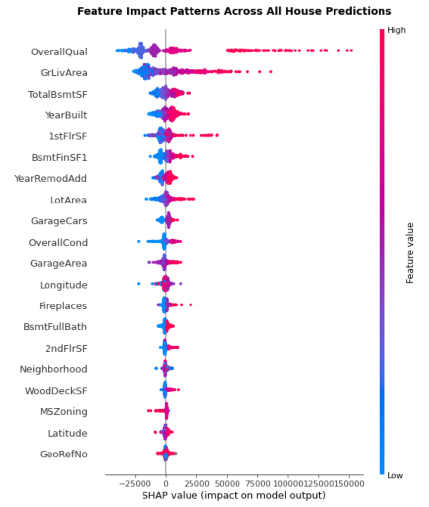
Reading the Summary Plot
The summary plot packs multiple insights into a single visualization:
Vertical Position: Features are ranked by importance, with the most impactful at the top. This gives us a clear hierarchy of what drives house prices.
Horizontal Spread: Each dot represents one house prediction. The wider the spread, the more variably that feature impacts predictions. Features with tight clusters have consistent effects, while scattered features have context-dependent impacts.
Color Coding: The color represents the feature value—red indicates high values, blue indicates low values. This reveals how feature values correlate with impact direction.
Key Patterns from Our Results:
OverallQual dominates: Sitting at the top with the widest spread, overall quality clearly drives the most variation in predictions. High quality ratings (red dots) consistently push prices up, while lower ratings (blue dots) push prices down.
GrLivArea shows clear trends: The second most important feature demonstrates a clear pattern—larger living areas (red) generally increase prices, smaller areas (blue) decrease them. The wide horizontal spread shows this effect varies significantly across houses.
TotalBsmtSF has interesting complexity: While generally following the “more is better” pattern, you can see some blue dots (smaller basements) on the positive side, suggesting basement impact depends on other factors.
YearBuilt reveals age premiums: The pattern shows newer homes (red dots) typically add value, but there’s substantial variation, indicating age interacts with other features.
Comparing SHAP vs Traditional Feature Importance
SHAP importance often differs from traditional tree-based feature importance. Let’s compare them:
|
1 2 3 4 5 6 7 8 9 10 11 12 13 14 15 16 17 18 19 20 21 22 23 24 25 26 27 28 29 |
# Compare SHAP importance with traditional feature importance print(“Feature Importance Comparison:”) print(“-“ * 50)
# SHAP-based importance (mean absolute SHAP values) shap_importance = np.mean(np.abs(shap_values), axis=0) shap_ranking = pd.DataFrame({ ‘Feature’: X_test.columns, ‘SHAP_Importance’: shap_importance }).sort_values(‘SHAP_Importance’, ascending=False)
# Traditional XGBoost feature importance xgb_importance = final_model.feature_importances_ xgb_ranking = pd.DataFrame({ ‘Feature’: X_test.columns, ‘XGBoost_Importance’: xgb_importance }).sort_values(‘XGBoost_Importance’, ascending=False)
print(“Top 10 Most Important Features (SHAP vs XGBoost):”) print(“SHAP Ranking\t\t\tXGBoost Ranking”) print(“-“ * 60) for i in range(10): shap_feat = shap_ranking.iloc[i][‘Feature’][:15] xgb_feat = xgb_ranking.iloc[i][‘Feature’][:15] print(f“{i+1:2d}. {shap_feat:15s}\t\t{i+1:2d}. {xgb_feat}”)
print(f“\nKey Insights:”) print(f“Most impactful feature: {shap_ranking.iloc[0][‘Feature’]}”) print(f“Average SHAP impact per feature: ${np.mean(shap_importance):,.0f}”) |
Output:
|
1 2 3 4 5 6 7 8 9 10 11 12 13 14 15 16 17 18 19 |
Feature Importance Comparison: ————————————————————————— Top 10 Most Important Features (SHAP vs XGBoost): SHAP Ranking XGBoost Ranking —————————————————————————————— 1. OverallQual 1. OverallQual 2. GrLivArea 2. GarageCars 3. TotalBsmtSF 3. 1stFlrSF 4. YearBuilt 4. Fireplaces 5. 1stFlrSF 5. GrLivArea 6. BsmtFinSF1 6. CentralAir 7. YearRemodAdd 7. BsmtQual 8. LotArea 8. KitchenQual 9. GarageCars 9. BsmtFullBath 10. OverallCond 10. MSZoning
Key Insights: Most impactful feature: OverallQual Average SHAP impact per feature: $2,685 |
What the Differences Tell Us
The comparison reveals interesting discrepancies between how features appear in tree splits versus their actual impact on predictions:
Consistent Leaders: Both methods agree that OverallQual is the top feature, validating its central role in house pricing.
Impact vs Usage: GrLivArea ranks highly in SHAP importance but lower in XGBoost importance. This suggests that while XGBoost doesn’t split on living area as frequently, when it does, those splits have major impact on final predictions.
Split Frequency vs Effect Size: Features like GarageCars and Fireplaces rank highly in XGBoost importance (frequent splits) but lower in SHAP importance (smaller actual impact). This indicates these features help with fine-tuning predictions rather than driving major price differences.
Global Insights for Decision Making
These patterns provide valuable insights for various stakeholders:
For Real Estate Professionals: Focus on overall quality and living area when evaluating properties—these drive the largest price variations. Basement space and home age are secondary but still significant factors.
For Home Buyers: Understanding that quality ratings have the biggest impact can guide inspection priorities and negotiation strategies.
For Data Scientists: The differences between traditional and SHAP importance highlight why SHAP explanations are valuable—they show actual prediction impact rather than just model mechanics.
For Feature Engineering: Features with high SHAP importance but inconsistent patterns (like TotalBsmtSF) might benefit from interaction terms or non-linear transformations.
The summary plot transforms your 36 carefully selected features into a clear hierarchy of prediction drivers, moving from individual explanations to dataset-wide understanding. This dual perspective—local and global—gives you complete visibility into your model’s decision-making process.
Practical Applications & Next Steps
Now that you’ve seen SHAP in action with XGBoost, you have a framework that extends far beyond this single example. The TreeExplainer approach we’ve used here works identically with other gradient boosting frameworks and tree-based models, making your SHAP skills immediately transferable.
SHAP Across Tree-Based Models
The same TreeExplainer setup works seamlessly with other tree-based models you might already be using. TreeExplainer automatically adapts to different tree architectures—whether it’s LightGBM’s leaf-wise growth strategy, CatBoost’s symmetric trees and ordered boosting features, Random Forest’s ensemble of trees, or standard Gradient Boosting implementations. The consistency across frameworks means you can compare model explanations directly, helping you choose between different algorithms based not just on performance metrics, but on interpretability patterns. To understand these different tree-based models in detail, explore our previous articles on Gradient Boosting foundations, Random Forest and ensemble methods, LightGBM’s efficient training, and CatBoost’s advanced categorical handling.
Moving Forward with SHAP
You now have the tools to make any tree-based model interpretable. Start applying SHAP to your existing models—you’ll likely discover insights about feature interactions and prediction patterns that traditional importance measures miss. The combination of local explanations for individual predictions and global insights for dataset-wide patterns gives you complete transparency into your model’s decision-making process.
SHAP transforms tree-based models from black boxes into transparent, explainable systems that stakeholders can understand and trust. Whether you’re explaining a single house price prediction to a client or analyzing feature patterns across thousands of predictions for model improvement, SHAP provides the principled framework you need to make machine learning interpretable.