


Diagnosing and Fixing Overfitting in Machine Learning with Python
Image by Author | Ideogram
Introduction
Overfitting is one of the most (if not the most!) common problems encountered when building machine learning (ML) models. In essence, it occurs when the model excessively learns from the intricacies (and even noise) found in the training data instead of capturing the underlying pattern in a way that allows for better generalization to future unseen data. Diagnosing whether your ML model suffers from this problem is crucial to effectively addressing it and ensuring good generalization to new data once deployed to production.
This article, presented in a tutorial style, illustrates how to diagnose and fix overfitting in Python.
Setting Up
We need data to train the model before diagnosing overfitting in an ML model. Let’s start by importing the necessary packages and creating a synthetic dataset prone to overfitting before training a regression model upon it.
Loading packages:
|
import numpy as np import matplotlib.pyplot as plt from sklearn.preprocessing import PolynomialFeatures from sklearn.linear_model import LinearRegression from sklearn.pipeline import make_pipeline from sklearn.model_selection import train_test_split from sklearn.metrics import mean_squared_error |
Dataset creation (largely following a sinusoidal pattern with some added noise):
|
def generate_data(n_samples=20, noise=0.2): np.random.seed(42) X = np.linspace(–3, 3, n_samples).reshape(–1, 1) y = np.sin(X) + noise * np.random.randn(n_samples, 1) return X, y
X, y = generate_data() X_train, X_test, y_train, y_test = train_test_split(X, y, test_size=0.3, random_state=42) |
Diagnosing Overfitting
There are two common approaches to diagnosing overfitting:
- One is by visualizing the model’s predictions or outputs as a function of inputs compared to the actual data. This is doable using plots, especially for lower-dimensional data, to see if the model is overfitting the training data rather than capturing the underlying pattern in a more generalizable manner.
- For models of higher complexity that are harder to visualize, another approach is to examine the difference between the accuracy (or error) in the training set and the testing or validation set. A large gap, where training performance is significantly better than test performance, is a strong indicator of overfitting.
Since we will be training a very low-complexity polynomial regression model to fit the low-dimensional, randomly generated dataset we created earlier, we will now define a function that trains a polynomial regression model and visualizes it alongside training and test data, as a means for diagnosing overfitting.
|
1 2 3 4 5 6 7 8 9 10 11 12 13 14 15 16 17 18 19 20 |
def train_and_view_model(degree): model = make_pipeline(PolynomialFeatures(degree), LinearRegression()) model.fit(X_train, y_train)
X_plot = np.linspace(–3, 3, 100).reshape(–1, 1) y_pred = model.predict(X_plot)
plt.scatter(X_train, y_train, color=‘blue’, label=‘Train data’) plt.scatter(X_test, y_test, color=‘red’, label=‘Test data’) plt.plot(X_plot, y_pred, color=‘green’, label=f‘Poly Degree {degree}’) plt.legend() plt.title(f‘Polynomial Regression (Degree {degree})’) plt.show()
train_error = mean_squared_error(y_train, model.predict(X_train)) test_error = mean_squared_error(y_test, model.predict(X_test)) print(f‘Degree {degree}: Train MSE = {train_error:.4f}, Test MSE = {test_error:.4f}’) return train_error, test_error
X_train, X_test, y_train, y_test = train_test_split(X, y, test_size=0.3, random_state=42) |
Let’s call this function to train and visualize a polynomial regressor with degree equal to 10. In general, the higher the degree, the more intricate the polynomial curve can become, hence the more tightly it can fit the training data. Therefore, a very high polynomial degree may increase the risk of a model that overfits the data, and also more unpredictable patterns can be exhibited by the model (curve), as we will see shortly.
|
overfit_degree = 10 train_and_view_model(overfit_degree) |
This is the resulting model and data visualization:
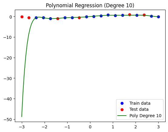
Polynomial regression model (degrees = 10).
Note that the custom function we defined before also prints the error made in training and test data, thus providing another overfitting diagnosis approach. In this model, we have a Mean Squared Error (MSE) of 0.0052 on training data, and a much higher error of 406.1920 on the test data, largely due to the drastic pattern seen on the left-hand side of the regression curve.
Fixing Overfitting
To fix overfitting in this example, we will apply a simple yet often effective strategy: simplifying the model. For a polynomial regression model, this entails reducing the degree of the curve. Let’s try for instance a degree equal to 3:
|
reduced_degree = 3 train_and_view_model(reduced_degree) |
Resulting visualization:
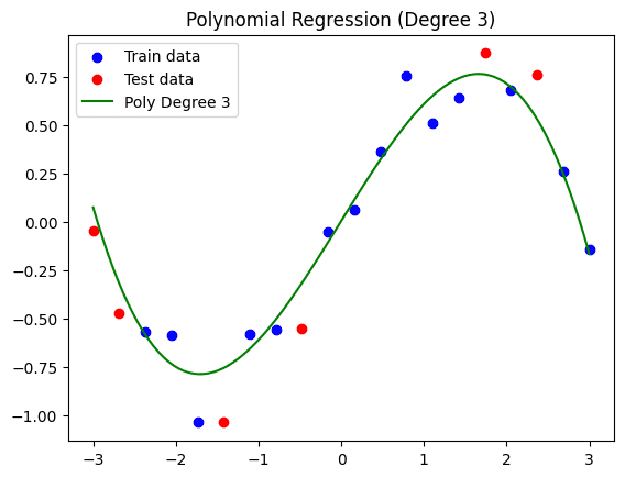
Simplified polynomial regression model (degrees = 3).
As we can see, while this curve does not fit the training set as a whole as tightly as the previous model did, we may have overcome the overfitting issue to some degree, thus coming up with a model that may generalize better to future distinct data. The resulting training MSE is 0.0139, whereas the test MSE is 0.0394. This time, while there is still a difference between the errors, it is much less drastic: a sign that this model is more generalizable.
Conclusion
This article unveiled the necessary practical steps to discover and tackle the overfitting problem in classical machine learning models trained in Python. Concretely, we illustrated how to spot and fix overfitting in a polynomial regression model by visualizing the model alongside the data, calculating the error made, and simplifying the model to make it more generalizable.